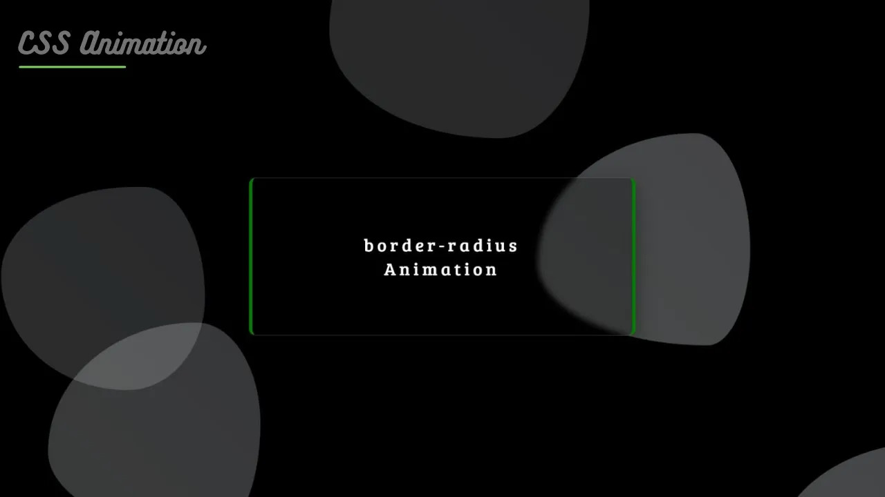
Create Blob Shape With Animation Using Only HTML & CSS
Hello Developers, In this post you will learn to create an awesome typewriter effect using HTML, CSS and JavaScript
Checkout the source code below and take reference from video to create this.
Watch Tutorial
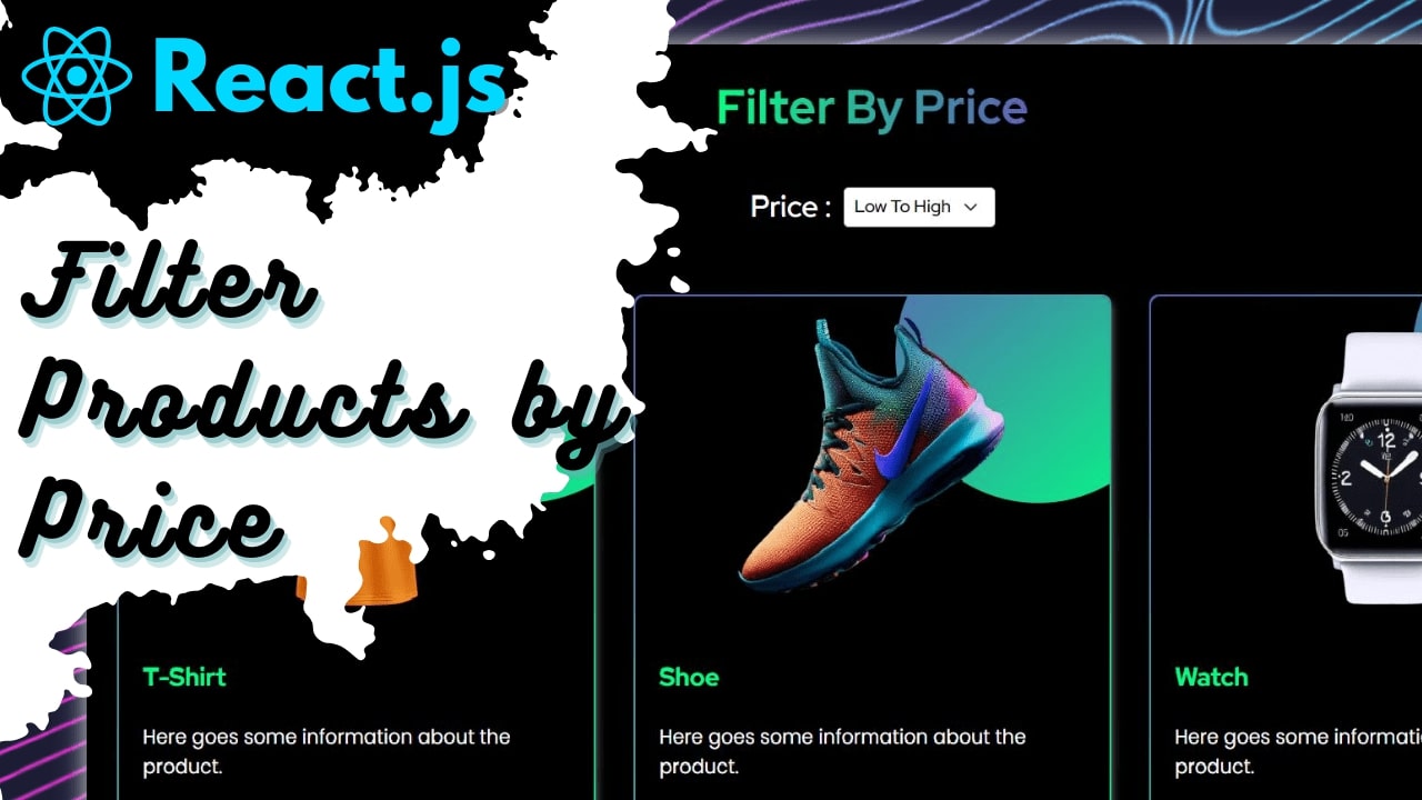
Filter product by their prices using React.js, Sass and Bootstrap
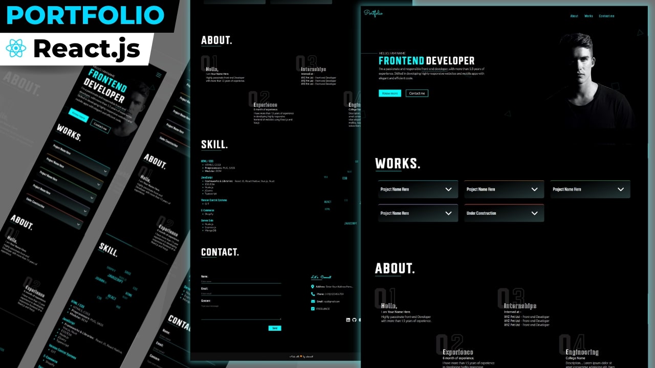
Create Responsive React.js Portfolio With Creative Animation & Hover Effects
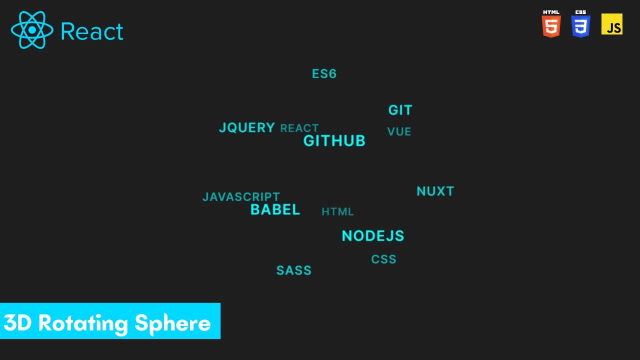
Create 3D Rotating Text Sphere Using React.js
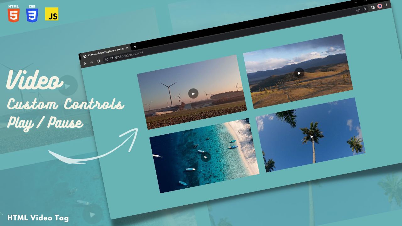
Create Custom Play/Pause button using HTML, CSS and JavaScript
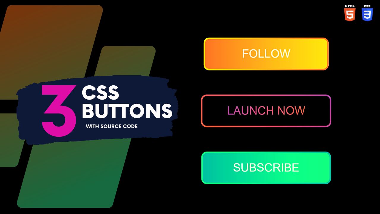
Create CSS Gradient Buttons with Hover Effects Using HTML and CSS
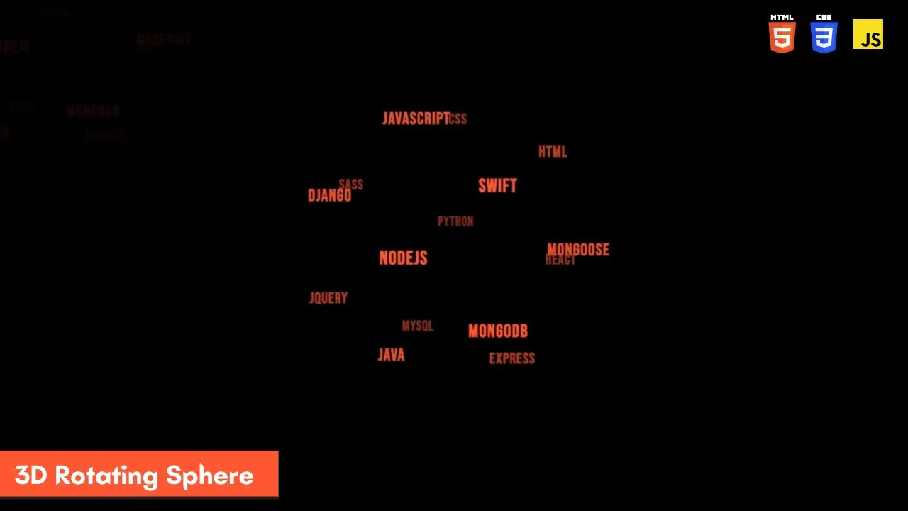
Create 3D Rotating Text Sphere Using HTML, CSS, JavaScript and TagCloud.js
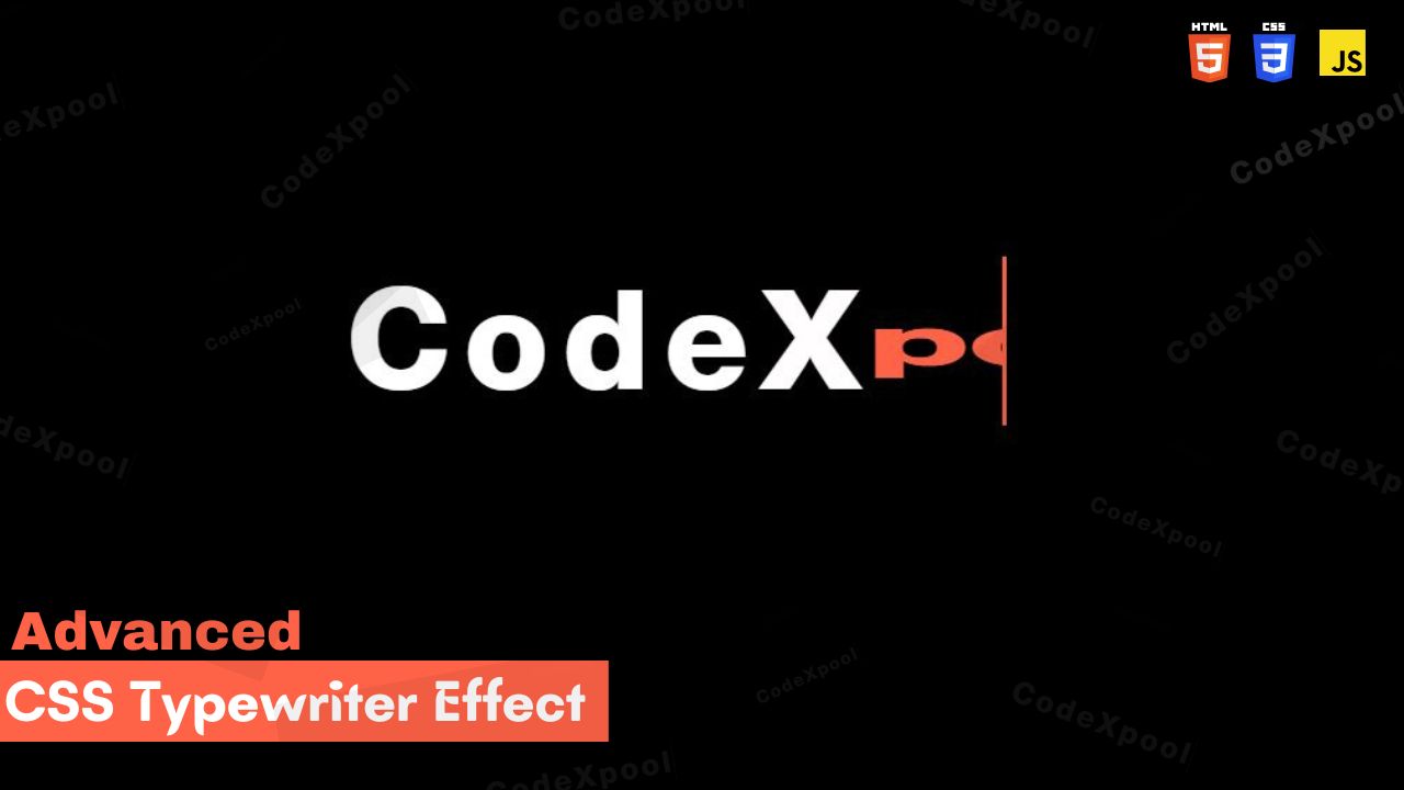
Create Advanced Typewriter Effect Using HTML CSS & JavaScript
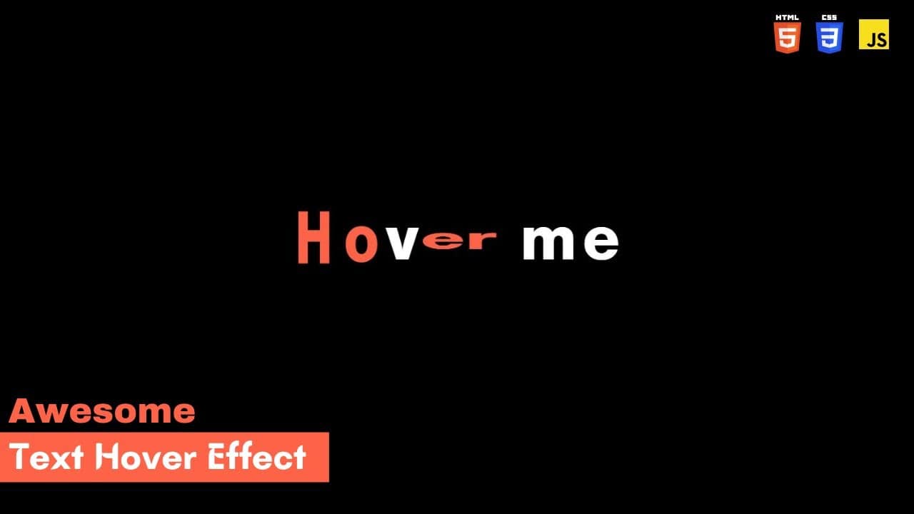
Create Advanced Text Hover Effect Using HTML CSS and JavaScript
HTML / JSX
<!DOCTYPE html>
<html lang="en">

<head>
    <meta charset="UTF-8">
    <meta http-equiv="X-UA-Compatible" content="IE=edge">
    <meta name="viewport" content="width=device-width, initial-scale=1.0">
    <title>Border Radius Animation</title>
    <link rel="stylesheet" href="style.css">
</head>

<body>
    <div class="shape" id="shape1"></div>
    <div class="shape" id="shape2"></div>
    <div class="shape" id="shape3"></div>
    <div class="shape" id="shape4"></div>
    <div class="shape" id="shape5"></div>
    <div id="container">
        <div id="textBox"><span id="text1">border-radius</span><span id="text2">Animation</span></div>
    </div>
</body>

</html>
CSS Code
      /*    Google fonts link    */
@import url('https://fonts.googleapis.com/css2?family=Bree+Serif&display=swap');
* {
	box-sizing: border-box;
	margin: 0;
	padding: 0;
}
:root {
	--primary: #f2faf8;
	--secondary: #e4e5ec;
}


body {
	background: black;
	overflow: hidden;
}


#shape1 {
	position: absolute;
	top: 2px;
	left: 85%;
	background: linear-gradient(45deg, var(--primary) 0%, var(--secondary) 100%);
	animation: anime1 12s linear infinite;
	border-radius: 60% 40% 30% 70% / 60% 30% 70% 40%;
	height: 300px;
	width: 300px;
	z-index: 2;
	display: inline-block;
}


@keyframes anime1 {
	0% {
		border-radius: 30% 48% 70% 40% / 50% 60% 50% 60%;
		opacity: 0.1;
		transform: rotate(90deg);
	}

	20% {
		border-radius: 74% 26% 20% 80% / 61% 55% 45% 39% ;
		transform: translate(-50px,200px);
        opacity: 0.3;
	}
	40% {
		border-radius: 25% 75% 44% 56% / 64% 35% 65% 36% ;
		transform: translate(-5px,400px);
        opacity: 0.3;
	}
	60% {
		border-radius: 74% 26% 20% 80% / 61% 55% 45% 39% ;
		transform: translate(-5px,600px);
        opacity: 0.3;
	}
	80% {
		border-radius:77% 23% 24% 76% / 54% 35% 65% 46%  ;
		transform: translate(-50px,660px);
        opacity: 0.3;
	}

	100% {
		border-radius:30% 48% 70% 40% / 50% 60% 50% 60% ;
		transform: translate(-180px,800px);
		opacity: 0.1;
	}
}


#shape2 {
    position: absolute;
	display: inline-block;
    top: 17px;
    left: 2%;
	background: linear-gradient(45deg, var(--primary) 0%, var(--secondary) 100%);
    animation: anime2 15s linear infinite;
    border-radius: 80% 20% 20% 80% / 42% 54% 46% 58%  ;
    height: 297px;
    width: 297px;
    z-index: 3;
}
@keyframes anime2 {
	0% {
		border-radius: 80% 20% 20% 80% / 42% 54% 46% 58% ;
		opacity: 0.1;
		transform: translate(-40px,58px);
	}

	50% {
		border-radius: 50% 48% 70% 42% / 50% 60% 50% 60%;
        opacity: 0.3;
		transform: translate(240px,558px);
	}

	100% {
		border-radius: 78% 22% 20% 80% / 57% 54% 46% 43% ;
		opacity: 0.1;
		transform: translate(112px,847px);
	}
}


#shape3{
	position: absolute;
	top: 540px;
	left: 25%;
	background: linear-gradient(45deg, var(--primary) 0%, var(--secondary) 100%);
	animation: anime3 18s linear infinite;
	border-radius: 60% 40% 30% 70% / 60% 30% 70% 40%;
	height: 380px;
	width: 380px;
	z-index: 4;
}
@keyframes anime3 {
	0% {
		border-radius: 74% 26% 20% 80% / 61% 55% 45% 39% ;
		transform: rotate(90deg);
		opacity: 0.1;
	}

	50% {
		border-radius:30% 70% 64% 36% / 54% 35% 65% 46% ;
		transform: translate(112px,-445px);
        opacity: 0.3;
	}

	100% {
		border-radius: 74% 26% 20% 80% / 61% 55% 45% 39% ;
		transform: translate(255px,-854px);
		opacity: 0.1;
	}
}


#shape4{
	position: absolute;
	top: 540px;
	left: 27%;
	background: linear-gradient(45deg, var(--primary) 0%, var(--secondary) 100%);
	animation: anime4 22s linear infinite;
	border-radius: 60% 40% 30% 70% / 60% 30% 70% 40%;
	height: 310px;
	width: 310px;
	z-index: 4;
}
@keyframes anime4 {
	0% {
		border-radius: 30% 70% 64% 36% / 54% 35% 65% 46% ;
		transform: rotate(90deg);
		opacity: 0.1;
	}

	50% {
		border-radius:74% 26% 20% 80% / 61% 55% 45% 39% ;
		transform: translate(482px,-345px);
        opacity: 0.3;
	}

	100% {
		border-radius:60% 40% 30% 70% / 60% 30% 70% 40% ;
		transform: translate(855px,-854px);
		opacity: 0.1;
	}
}


#shape5{
	position: absolute;
	top: -25px;
	left: 27%;
	background: linear-gradient(45deg, var(--primary) 0%, var(--secondary) 100%);
	animation: anime5 20s linear infinite;
	border-radius: 60% 40% 30% 70% / 60% 30% 70% 40%;
	height: 310px;
	width: 310px;
	z-index: 4;
}
@keyframes anime5 {
	0% {
		border-radius: 30% 70% 64% 36% / 54% 35% 65% 46% ;
		transform: rotate(90deg);
		opacity: 0.1;
	}

	50% {
		border-radius:74% 26% 20% 80% / 61% 55% 45% 39% ;
		transform: translate(-182px,345px);
        opacity: 0.3;
	}

	100% {
		border-radius:60% 40% 30% 70% / 60% 30% 70% 40% ;
		transform: translate(-355px,854px);
		opacity: 0.1;
	}
}

#container{
	position: fixed;
	top: 0px;
	left: 0px;
	display: inline-block;
	z-index: 5;
	width: 100vw;
	height: 100vh;

}
#textBox{
	position: absolute;
	top: 260px;
	left: 31%;
	z-index: 6;
	width: 564px;
	height: 231px;
	background: rgba( 0, 0, 0, 0.25 );
	box-shadow: 0 8px 32px 0 rgb(0 0 0 / 37%);
	backdrop-filter: blur( 4px );
	-webkit-backdrop-filter: blur( 4px );
	border-radius: 10px;
	border: 1px solid rgba( 255, 255, 255, 0.18 );
	border-right: 5px solid green;
	border-left: 5px solid green;
	font-family: 'Bree Serif', serif;
	letter-spacing: 5px;
	font-size: 26px;
	color: white;
	display: flex;
	flex-direction: column;
	align-items: center;
	justify-content: center;

}