Advanced Typewriter Effect Using HTML, CSS and JavaScript

👋 Hi there, In this post you will learn to create an awesome typewriter effect using HTML, CSS and JavaScript
Checkout the source code below and take reference from video to create this.
Watch Tutorial
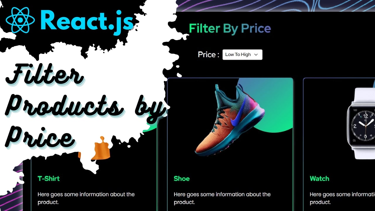
Filter product by their prices using React.js, Sass and Bootstrap
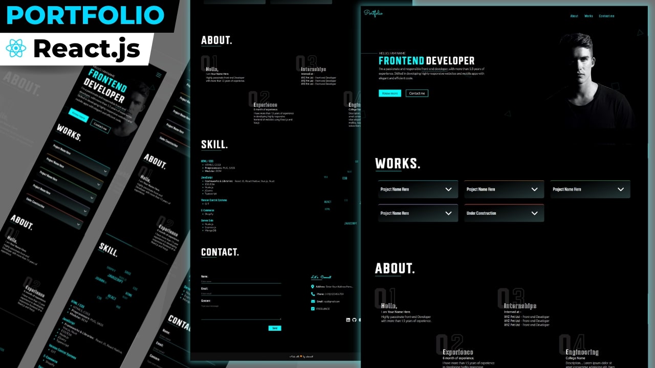
Create Responsive React.js Portfolio With Creative Animation & Hover Effects
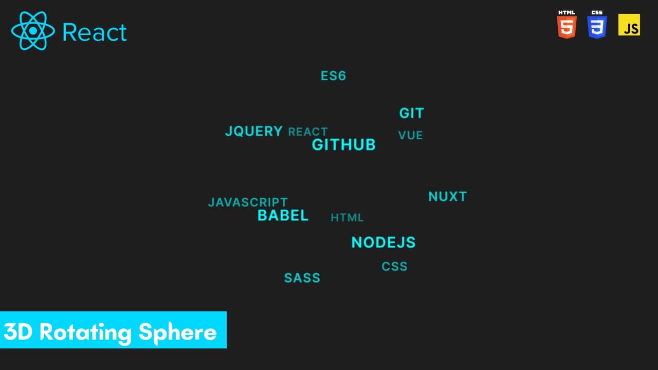
Create 3D Rotating Text Sphere Using React.js

Create Custom Play/Pause button using HTML, CSS and JavaScript
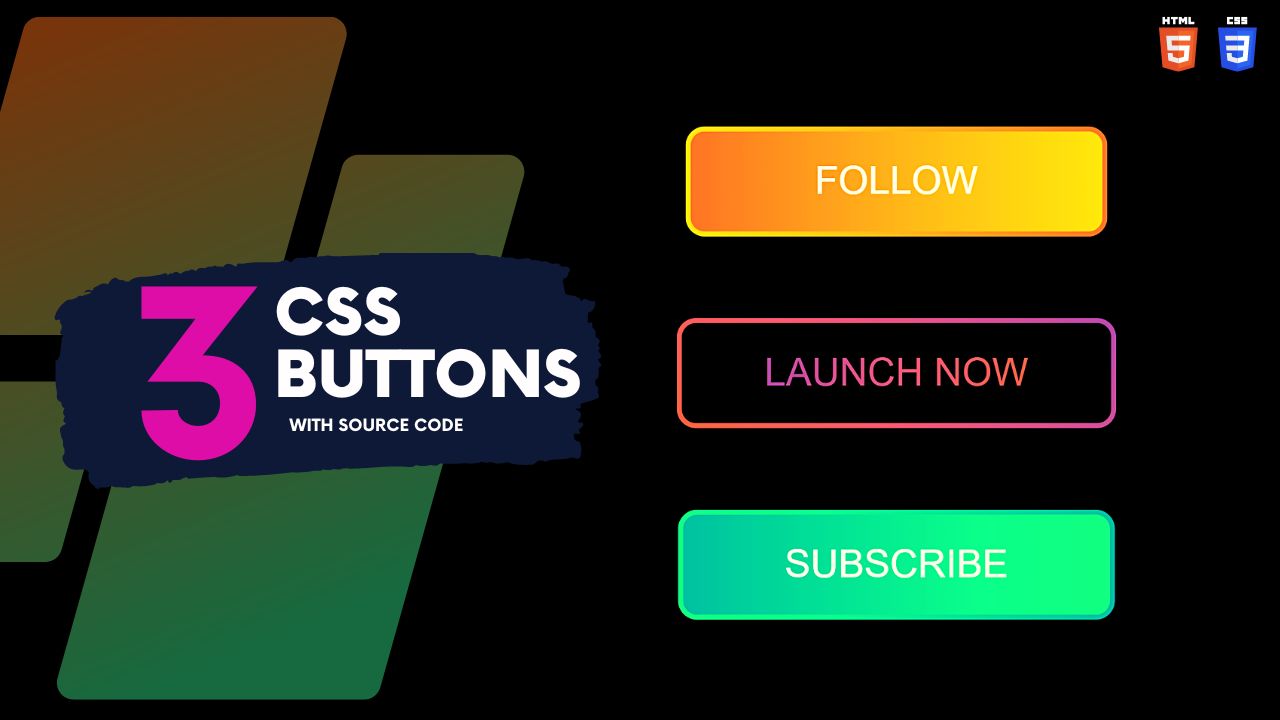
Create CSS Gradient Buttons with Hover Effects Using HTML and CSS
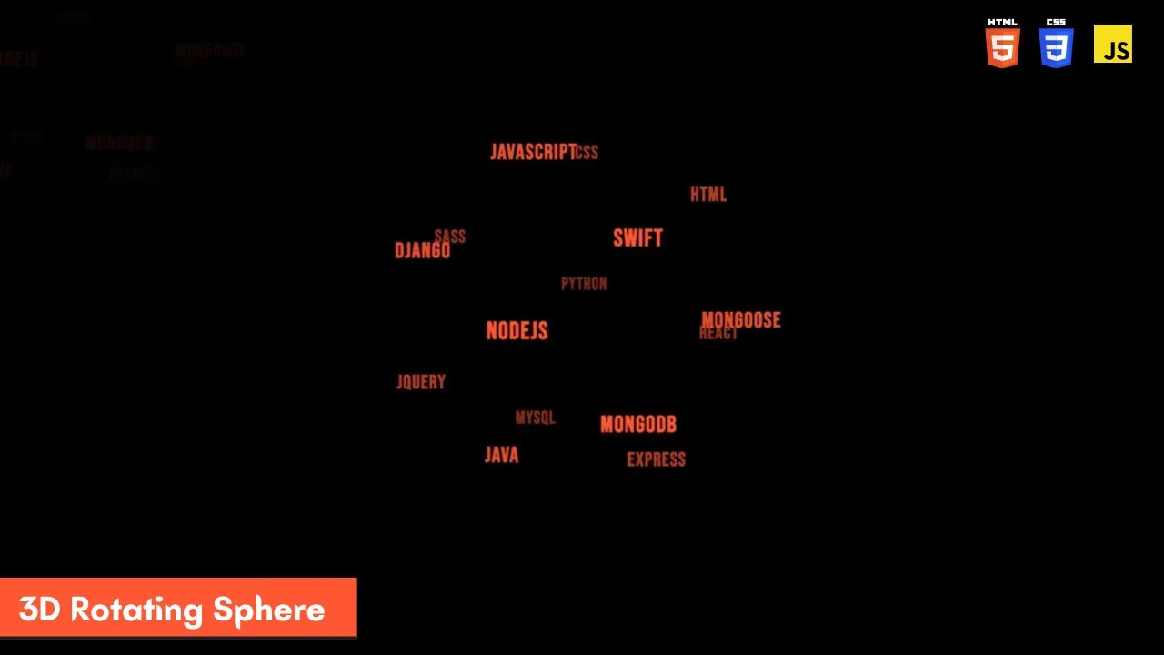
Create 3D Rotating Text Sphere Using HTML, CSS, JavaScript and TagCloud.js
Create Advanced Typewriter Effect Using HTML CSS & JavaScript
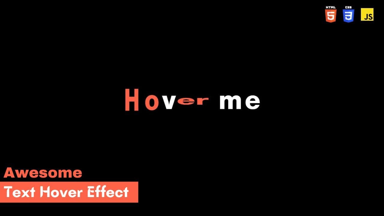
Create Advanced Text Hover Effect Using HTML CSS and JavaScript
HTML / JSX
<!DOCTYPE html>
<html lang="en">
<head>
    <meta charset="UTF-8">
    <meta http-equiv="X-UA-Compatible" content="IE=edge">
    <meta name="viewport" content="width=device-width, initial-scale=1.0">
    <title>Typewriter Effect</title>
    <link rel="stylesheet" href="style.css">
</head>

<body>
    <div id="box" class="typed-out">
        <h1 class="alpha">C</h1>
        <h1 class="alpha2 alpha">o</h1>
        <h1 class="alpha3 alpha">d</h1>
        <h1 class="alpha4 alpha">e</h1>
        <h1 class="alpha5 alpha">X</h1>
        <h1 class="alpha6 alpha">p</h1>
        <h1 class="alpha7 alpha">o</h1>
        <h1 class="alpha8 alpha">o</h1>
        <h1 class="alpha9 alpha">l</h1>
    </div>


    <!-- JavaScript For Animation     -->
    <script>

        const elements = document.getElementsByClassName('alpha');
        const elements2 = document.getElementsByClassName('alpha2');
        const elements3 = document.getElementsByClassName('alpha3');
        const elements4 = document.getElementsByClassName('alpha4');
        const elements5 = document.getElementsByClassName('alpha5');
        const elements6 = document.getElementsByClassName('alpha6');
        const elements7 = document.getElementsByClassName('alpha7');
        const elements8 = document.getElementsByClassName('alpha8');
        const elements9 = document.getElementsByClassName('alpha9');
        for (let i = 0; i <= elements.length; i++) {
            elements[i].addEventListener('animationend', function (e) {
                elements[i].classList.remove('animated');
            });
            elements[i].classList.add('animated');
            elements2[i].classList.add('animated2');
            elements3[i].classList.add('animated3');
            elements4[i].classList.add('animated4');
            elements5[i].classList.add('animated5');
            elements6[i].classList.add('animated6');
            elements7[i].classList.add('animated7');
            elements8[i].classList.add('animated8');
            elements9[i].classList.add('animated9');
        }

    </script>
</body>

</html>
CSS Code
     /*          Imported Google Font Family Link             */
@import url('https://fonts.googleapis.com/css2?family=Almarai:wght@800&display=swap');
*{
  margin: 0;
  padding: 0;
}
body {
  background-color: #000000;
}
#box{
  display: flex;
  position: absolute;
  top: 285px;
  left: 33vw;
}

.alpha{
  color: #FFFFFF;
  font-size: 77px;
  font-family: 'Almarai',sans-serif;
  margin: 4px;
}

/*     Animating First Letter   */
.alpha.animated{
  animation: ani 0.9s ease-in-out 1;
}
@keyframes ani {
  0%{
    color: #ff6347;
    transform: scale(1.2,0.5);
  }
  16%{
    color: #ff6347;
    transform: scale(1.2,0.5);
  }
  25%{
    color: #ff6347;
    transform: scale(1.2,0.5);
  }
  32%{
    color: #ff6347;
    transform: scale(0.8,1.1);
  }
  48%{
    transform: scale(0.95,1);
  }
  64%{
    transform: scale(0.8,1.2);
  }
  80%{
    transform: scale(1.15,1);
  }
  87%{
    transform: scale(1.15,1);
  }
  90%{
    /* This will add the shaking effect one time almost at the end   */
    transform: scale(0.8,1);
  }
  95%{
    transform: scale(1.05,1);
  }
  100%{
    transform: scale(1,1);
  }
}

/*          Animating Second Letter           */
.alpha2.animated2{
  animation: ani2 0.9s ease-in-out 0.1s 1;
}
@keyframes ani2 {
  0%{
    color: #ff6347;
    transform: scale(1.2,0.5);
  }
  16%{
    color: #ff6347;
    transform: scale(1.2,0.5);
  }
  25%{
    color: #ff6347;
    transform: scale(1.2,0.5);
  }
  32%{
    color: #ff6347;
    transform: scale(0.8,1.1);
  }
  48%{
    transform: scale(0.95,1);
  }
  64%{
    transform: scale(0.8,1.2);
  }
  80%{
    transform: scale(1.15,1);
  }
  87%{
    transform: scale(1.15,1);
  }
  90%{
    /* This will add the shaking effect one time almost at the end   */
    transform: scale(0.8,1);
  }
  95%{
    transform: scale(1.05,1);
  }
  100%{
    transform: scale(1,1);
  }
}
/*          Animating Third Letter           */
.alpha3.animated3{
  /* color: #ff6347; */
  animation: ani3 0.9s ease-in-out 0.2s 1;
}
@keyframes ani3 {
  0%{
    color: #ff6347;
    transform: scale(1.2,0.5);
  }
  16%{
    color: #ff6347;
    transform: scale(1.2,0.5);
  }
  25%{
    color: #ff6347;
    transform: scale(1.2,0.5);
  }
  32%{
    color: #ff6347;
    transform: scale(0.8,1.1);
  }
  48%{
    transform: scale(0.95,1);
  }
  64%{
    transform: scale(0.8,1.2);
  }
  80%{
    transform: scale(1.15,1);
  }
  87%{
    transform: scale(1.15,1);
  }
  90%{
    /* This will add the shaking effect one time almost at the end   */
    transform: scale(0.8,1);
  }
  95%{
    transform: scale(1.05,1);
  }
  100%{
    transform: scale(1,1);
  }
}
/*          Animating Fourth Letter           */
.alpha4.animated4{
  animation: ani4 0.9s ease-in-out 0.3s 1;
}
@keyframes ani4 {
  0%{
    color: #ff6347;
    transform: scale(1.2,0.5);
  }
  16%{
    color: #ff6347;
    transform: scale(1.2,0.5);
  }
  25%{
    color: #ff6347;
    transform: scale(1.2,0.5);
  }
  32%{
    color: #ff6347;
    transform: scale(0.8,1.1);
  }
  48%{
    transform: scale(0.95,1);
  }
  64%{
    transform: scale(0.8,1.2);
  }
  80%{
    transform: scale(1.15,1);
  }
  87%{
    transform: scale(1.15,1);
  }
  90%{
    /* This will add the shaking effect one time almost at the end   */
    transform: scale(0.8,1);
  }
  95%{
    transform: scale(1.05,1);
  }
  100%{
    transform: scale(1,1);
  }
}
/*          Animating Fifth Letter           */
.alpha5.animated5{
  animation: ani5 0.9s ease-in-out 0.6s 1;
}
@keyframes ani5 {
  0%{
    color: #ff6347;
    transform: scale(1.2,0.5);
  }
  16%{
    color: #ff6347;
    transform: scale(1.2,0.5);
  }
  25%{
    color: #ff6347;
    transform: scale(1.2,0.5);
  }
  32%{
    color: #ff6347;
    transform: scale(0.8,1.1);
  }
  48%{
    transform: scale(0.95,1);
  }
  64%{
    transform: scale(0.8,1.2);
  }
  80%{
    transform: scale(1.15,1);
  }
  87%{
    transform: scale(1.15,1);
  }
  90%{
    /* This will add the shaking effect one time almost at the end   */
    transform: scale(0.8,1);
  }
  95%{
    transform: scale(1.05,1);
  }
  100%{
    transform: scale(1,1);
  }
}
/*          Animating Sixth Letter           */
.alpha6.animated6{
  animation: ani6 0.9s ease-in-out 1.3s 1;
}
@keyframes ani6 {
  0%{
    color: #ff6347;
    transform: scale(1.2,0.5);
  }
  16%{
    color: #ff6347;
    transform: scale(1.2,0.5);
  }
  25%{
    color: #ff6347;
    transform: scale(1.2,0.5);
  }
  32%{
    transform: scale(0.8,1.1);
  }
  48%{
    transform: scale(0.95,1);
  }
  64%{
    transform: scale(0.8,1.2);
  }
  80%{
    transform: scale(1.15,1);
  }
  87%{
    transform: scale(1.15,1);
  }
  90%{
    /* This will add the shaking effect one time almost at the end   */
    transform: scale(0.8,1);
  }
  95%{
    transform: scale(1.05,1);
  }
  100%{
    transform: scale(1,1);
  }
}
/*          Animating Seventh Letter           */
.alpha7.animated7{
  animation: ani7 0.9s ease-in-out 1.4s 1;
}
@keyframes ani7 {
  0%{
    color: #ff6347;
    transform: scale(1.2,0.5);
  }
  16%{
    color: #ff6347;
    transform: scale(1.2,0.5);
  }
  25%{
    color: #ff6347;
    transform: scale(1.2,0.5);
  }
  32%{
    transform: scale(0.8,1.1);
  }
  48%{
    transform: scale(0.95,1);
  }
  64%{
    transform: scale(0.8,1.2);
  }
  80%{
    transform: scale(1.15,1);
  }
  87%{
    transform: scale(1.15,1);
  }
  90%{
    /* This will add the shaking effect one time almost at the end   */
    transform: scale(0.8,1);
  }
  95%{
    transform: scale(1.05,1);
  }
  100%{
    transform: scale(1,1);
  }
}
/*          Animating Eighth Letter           */
.alpha8.animated8{
  animation: ani8 0.9s ease-in-out 1.5s 1;
}
@keyframes ani8 {
  0%{
    color: #ff6347;
    transform: scale(1.2,0.5);
  }
  16%{
    color: #ff6347;
    transform: scale(1.2,0.5);
  }
  25%{
    color: #ff6347;
    transform: scale(1.2,0.5);
  }
  32%{
    transform: scale(0.8,1.1);
  }
  48%{
    transform: scale(0.95,1);
  }
  64%{
    transform: scale(0.8,1.2);
  }
  80%{
    transform: scale(1.15,1);
  }
  87%{
    transform: scale(1.15,1);
  }
  90%{
    /* This will add the shaking effect one time almost at the end   */
    transform: scale(0.8,1);
  }
  95%{
    transform: scale(1.05,1);
  }
  100%{
    transform: scale(1,1);
  }
}
/*          Animating Ninth Letter           */
.alpha9.animated9{
  animation: ani9 0.9s ease-in-out 1.7s 1;
}
@keyframes ani9 {
  0%{
    color: #ff6347;
    transform: scale(1.2,0.5);
  }
  16%{
    color: #ff6347;
    transform: scale(1.2,0.5);
  }
  25%{
    color: #ff6347;
    transform: scale(1.2,0.5);
  }
  32%{
    transform: scale(0.8,1.1);
  }
  48%{
    transform: scale(0.95,1);
  }
  64%{
    transform: scale(0.8,1.2);
  }
  80%{
    transform: scale(1.15,1);
  }
  87%{
    transform: scale(1.15,1);
  }
  90%{
    /* This will add the shaking effect one time almost at the end   */
    transform: scale(0.8,1);
  }
  95%{
    transform: scale(1.05,1);
  }
  100%{
    transform: scale(1,1);
  }
}

/*    TypeWriter Effect      */

.typed-out{
  overflow: hidden;
  border-right: .15em solid #ff6347;
  white-space: nowrap;
  animation: typing 1.9s steps(20, end) forwards, blinking .8s infinite;
  width: 0;

}
@keyframes typing {
  from {
    width: 0%;
  }
  to {
    width: 33%;
  }
}
@keyframes blinking {
  from {
    border-color: transparent;
    }
  to {
  border-color: #ff6347;
  }
}